Astrolearn Progress Report:
German-language Astrological Journals and Almanacs;
Presentational Enhancements to Astrolearn
– May 28th, 2016
Greetings, friends, scholars and astrology enthusiasts!
I have lately begun a programme of presentational enhancements to the existing pages within the Astrolearn web site. Previously my main focus has been the development of content and the preparation of scanned text products; and the presentation of pages has been less than optimal.
Previous visitors may already have noticed that I have excised a lot of verbiage from the upper reaches of several of the main pages, either by shortening my form of expression (as on the home page), or by moving whole paragraphs down to footnotes. The idea behind this was to make access to the links to usable contents quicker and more direct and convenient.
Further, I’ve created multi-part internal page indices for several of the longest main pages besides the Links page on which this was achieved a good month ago. The About, Used Books, Bibliography and Articles pages all now have comparable facilities. You only have to click on the item on the initial index that most closely corresponds to your destination to be jumped directly down to the relevant section of the page. Pale purple links marked ‘RETURN TO TOP‘ have been installed between each jump destination, allowing you quickly to return to the internal page index and select another option. These measures should vastly cut down on the need for tedious scrolling as well as making the structure of the page contents more immediately apparent towards the top. I hope there will be no objections to these amendments.
I’ve made a few belated enhancements to the appearances of the various CD and DVD product-related pages, such as standardising the shades of green on headings and links across the entire site. Some may remember that the articles and products menu pages initially deployed rather lurid, bright shades of green for links. I replaced all of these on the articles page with the now-standard deeper shades months ago but had left the job unfinished on the CD product pages. I find that the deeper shade of green makes text much easier to read as well as easier on the eyes than the bright ones. I’ve also spaced out the links to the individual CD product pages slightly better as they seemed to be too cramped together before for the details of each to clearly stand out to the eyes.
Perhaps more significantly, I’ve begun to go through the site colouring in all the footnote links and numerical markers in deep blue. By default, they displayed black before, making it very difficult to see them at all within dense text, especially on the bibliography pages where they appeared indistinguishable from some of the pagination details. This, however, will be an enormous undertaking to complete, with so many hundreds of pages affected. Nevertheless, within the past week I have completed it for all the English- and French-language journals and almanacs pages within the bibliography. At the same time, I’ve placed any footnote links that had not previously been set thus in superscript, within these pages, to make them stand out better.
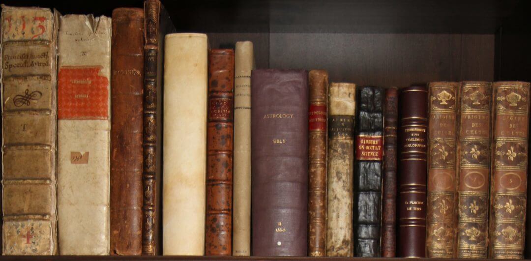
Prior to this step, I had finally (as long promised) uploaded most of the German language periodicals pages to the bibliography. This includes magazines and (separately) almanacs in German. Several titles have been left behind until a later date for a variety of reasons (fear not as they will be uploaded eventually), but most that are in the collection are there. The correct formatting for the footnote links and markers was instituted for all these pages at the time of their creation. That made me realise how important it was to retroactively do the same for the rest of the bibliography.
However, the books part of the bibliography still needs to be reprocessed for the most part. I have just done small amounts of it between pages 21 and 40 in past weeks – at the same time as adding ‘Continue’ and ‘Back’ links to the feet of the first 40 pages. These pages are all long, so it is slow work and I cannot do many in one day. I expect this to be an ongoing job in spare moments over June and beyond, but I expect to get there eventually.
I’ve also been thinking ahead and looking around at custom fonts that could eventually be used to replace drab old Arial. I’m stuck with Arial for now because it’s free and legible on screens. I really don’t like the experience of reading serif fonts like Times New Roman on screens, even though quite a lot of web sites still display in Times New Roman by default. Arial is functional, but boring. Eventually I hope to upgrade the whole site to a more modern paid-for font that makes reading a pleasure rather than a stiff, mechanical process, as Arial can make it seem. However, that is not a priority, so functionality will be the order of the day for some time yet. I’d appreciate any feedback on this point, nonetheless, and I do think that possibly in 2017 or 2018 it will be a good time to upgrade to a more modern, aesthetically pleasing font throughout the site, although it will have to be chosen carefully when the time comes.
With best wishes to all,
Philip
Leave a Reply